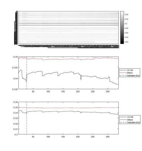
So trying to get some notion of what’s going on within these eras, I thought it might be useful to look at all the eras together.
This next covers all the eras in the Training and Tournament groups, with the same messy labels  (I really have to do something about that) The dashed vertical line in the second plot marks the end of the training and validation eras.
It’s interesting (to me at least) how the mean STD changes in behaviour…
To look a little more closely at that, I thought to bring out my (t)rusty principal components (PCA) tools One of the handy things about PCA is that it concentrates variance in the first few columns of its output matrix (often referred to as scores), and packs the means into vectors I’m happy to forget about for now.
What I next did was PCA every feature group in each era, and then packed the results back into an array of Nx310 elements, where N is the the number of eras. This is the result:
On the left is the column means of the PCA scores (all on the order of 10-16; on the right are the standard deviations of each era for each each set of features. Note how the large values appear now in the first column (leftmost) of each feature group.
So with those I thought to see what those first columns look like when plotted out, and here’s the result:
Whether those are enough to strongly associate separate eras in a Numerai useful way, I really don’t know; maybe they are, and maybe they aren’t. But in any case, I do find them interesting.
Next I took the leading columns of each of the feature group scores for the first 148 eras (ok, I cheat, and didn’t stick to just training data), and used them to build a Gaussian Mixture model. This one has 5 components, though I think four may be better for dependence on the Training models only, and one can use a lot more if we look for associations across the whole set of eras.
The plot is a bit hard to read. Given an era, the mixture model gives you posterior probabilities for that era relative to each of the mixture components, so that the sum of the probabilities for any given era across the five components is one. Now whether that can be used in analysing the likelihood of good scores remains to be seen, but I’ll leave that to next week. I’ve got to get my Tournament stuff done (but this is more fun.)


