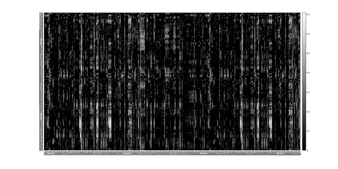
So I’ve started looking at the new data, first by looking at the correlations between the features and the targets for the training set. There’s some interesting patterns showing up.
By way of process, what I did was take each era, Spearman correlate it with all the available targets. A small percentage of the targets, ~0.25%, had to be cooked (replaced with 0.5) as they were showing up as NaNs. There’s better ways, but that’ll do for now.
There’s 21 targets for each era, two of which (“target” and “target_nomi_20”)) are the same, so that gets double counted. Then, for each era, along each variable, the RMS value of the correlations is taken, and normalized to its median value across the 1050 variables, with values <1 set to one. It’s a bit of a hack, but quite useful for detecting patterns in data. The results are plotted on a log10 scale, from 0 to about 0.7.
The vertical coordinates are era (from top to bottom) and variable (left to right).
So here’s a jpeg of that:
Now I don’t know how clearly that plot will show up for the reader, but there’s some interesting artifacts. First off is the repeated patterns separated by about 210 bins horizontally. Those are clearest, at least for me, in the 5 thin vertical lines pretty much running continuously from top to bottom.
Here’s a blown up view:
which brings into focus more the way the peak correlation moves a bit from bin to bin – particularly in the area slightly to the right of centre, and the way it spreads, forming blocks or pulses. Maybe it’s time to resurrect my trackers
What’s it mean? ![]()
Tomorrow maybe I’ll try the same for the Validation data.


