TC vs CORR vs FNCv3 vs CorrWMetaModel

This is an analysis that I did already some time ago, but this time we have more data, rounds 300 to 512

Note: the correlation used in these plots is corr20 field available in the roundDetails.modelData API. It is not clear if that is the new corrV2 or the old one. I would love to compare the two but they are currently not available: there are plenty of corr* fields, but only corr20 and corj60 are populated. It would be possible to retrieve both correlations (old and the new v2) via v3UserProfile API. Here there is an example on how to use that API. However it is too slow to download data via v3UserProfile, so I won’t do that.

TC vs CORR

Here we see the basic relationship between TC and CORR (left plot) and to highlight the results we also group CORR by bin (positive corr → bins 1,2,3,4,5 and negative corr → bins -1,-2,-3,-4,-5) and display the mean TC for each bin (right plot).

While there is definitely some positive correlation between the values (the plot shows a positive regression slope), there are ways too many positive CORR values with negative TC and way too many negative CORR values with positive TC. A user would need hundreds of models to be able to take advantage of this small correlation without being affected by the noise.

Since there are good rounds where the average CORR is positive and bad rounds with negative average CORR, it is also interesting to compare TC and CORR relative to the round: that is we want to see if top (or bottom) CORR values matches top (or bottom) TC values for that round, independently of their absolute values. To do so we can plot the zscore of TC and CORR computed by round (zscore(metrics) = (metrics - metricsRoundMean) / metricsRoundStdDev).

Unfortunately this plot tells us more or less the same story about TCvsCORR.

TC vs FncV3

Some plots but for FncV3. Similarly to CORR there is a positive correlation between TC and FncV3 but it is vert noisy.

TC vs CorrWMetaModel

Nothing interesting to report on CorrWMetaModel. Being uncorrelated to the Meta Model doesn’t give automatically a positive TC and vice versa. We’ll see later if the combination of CORR and CorrWMetaModel shows something different.

TC vs CORR by FncV3

Let’s see how TCvsCORR relationship varies across FncV3 values. We split the model FncV3 values into bins (positive FncV3 → bins 1,2,3,4,5 and negative FncV3 → bins -1,-2,-3,-4,-5) and we plot TCvsCORR for each FncV3 bin.

Interesting enough, higher/lower FncV3 values (bins -5 and 5) result in a stronger correlation between TC and CORR.

However it looks different if we plot the same data using the zscore of TC and CORR.

TC vs CORR by CorrWMetaModel

Let’s see how TCvsCORR relationship varies in relationship to a model correlation with the MetaModel. We split the model CorrWMetaModel values into bins (positive CorrWMetaModel → bins 1,2,3,4,5 and negative CorrWMetaModel → bins -1,-2,-3,-4,-5) and we plot TCvsCORR for each bin.

It seems that models with low correlation with the MetaModel (bins -1 and 1) have a slightly stronger TCvsCORR relationship, even if we plot the same data using the zscore of TC and CORR.

TC vs CORR by Round

The last thing I wanted to check is how TCvsCORR relationship varies over time and you can see the variance is very high and even inversely correlated at some points in time. By the way, we can see that the average CorrWMetaModel of all models is decreasing over time.

I also wanted to verify if TCvsCORR relationship depends on how easy/difficult a round was (positive or negative mean round payout/corr/tc). The naive idea I wanted to double-check is: “when the round average correlation is negative then TC rewards models differently”.

12 Likes

This is the code to download the data.

from numerapi import NumerAPI
import pandas as pd
import json

napi = NumerAPI(
    #    public_id='',
    #    secret_key='',
    verbosity="info")

START_ROUND = 300
END_ROUND = 512
TOURNAMENT = 8

query = """
  query($roundNumber: Int!, $tournament: Int!) {
    roundDetails (roundNumber: $roundNumber, tournament: $tournament) {
      roundId
      roundNumber
      tournament
      roundTarget
      status
      isDaily
      roundResolved
      roundResolveTime
      totalStakes
      totalAtStake
      totalPayout
      payoutFactor
      totalSubmitted
      models {
        roundId
        modelName
        selectedStakeValue
        payoutSettled
        tc
        corr
        corrV4
        corr20
        corr60
        corj60
        corrWMetaModel
        fnc
        fncV3
        fncV4
        icV2
        ric
      }
   }
}
"""

allPerfs = []
rounds = []
for round_num in range(START_ROUND, END_ROUND+1):

    print("roundNumber   ", round_num)

    arguments = {'roundNumber': round_num, 'tournament': TOURNAMENT}
    roundDetails = napi.raw_query(query, arguments)['data']['roundDetails']

    perf = pd.DataFrame(roundDetails['models'])
    perf['roundNumber'] = round_num
    allPerfs.append(perf)

    r = {k: v for k, v in roundDetails.items() if k != 'models'}
    rounds.append(r)

pd.DataFrame(rounds).to_csv(f'round-details.csv', index=False)
pd.DataFrame(pd.concat(allPerfs)).to_csv(f'round-{START_ROUND}-{END_ROUND}.csv', index=False)

5 Likes

This is the code for the plots

import pandas as pd
import numpy as np
import matplotlib.pyplot as plt
import seaborn as sns

CORR_COL='corr20'

df = pd.read_csv('round-300-512.csv')

def symmetricBins(df, numBins, column):
    if (df[column] > 0).any():
        df.loc[ df[column] > 0, column+'Bin'] = pd.qcut(df.loc[ df[column] > 0, column], numBins, labels=False) + 1
    if (df[column] < 0).any():
        df.loc[ df[column] < 0, column+'Bin'] = pd.qcut(df.loc[ df[column] < 0, column], numBins, labels=False) - numBins
    df.loc[ df[column] == 0, column+'Bin'] = 0

def zscore(df, column):
    b = df.groupby(['roundNumber']).apply(lambda x: (x[column] - x[column].mean()) / x[column].std())
    b.name = column + 'Zscore'
    b = pd.DataFrame(b).reset_index(level='roundNumber')
    df[column + 'Zscore'] = b[column + 'Zscore']


def meanByRound(df, column):
    df[column + 'RoundMean'] = df.groupby(['roundNumber'])[column].transform('mean')

#
# Add few additional columns to our data
#

NUM_BINS=5

symmetricBins(df, NUM_BINS, 'tc')
symmetricBins(df, NUM_BINS, CORR_COL)
symmetricBins(df, NUM_BINS, 'fncV3')
symmetricBins(df, NUM_BINS, 'corrWMetaModel')

zscore(df, 'tc')
zscore(df, CORR_COL)
zscore(df, 'fncV3')
zscore(df, 'corrWMetaModel')

meanByRound(df, "tc")
meanByRound(df, CORR_COL)
meanByRound(df, "payoutSettled")

symmetricBins(df, NUM_BINS, 'tcRoundMean')
symmetricBins(df, NUM_BINS, CORR_COL+'RoundMean')
symmetricBins(df, NUM_BINS, 'payoutSettledRoundMean')

#
# Do the plotting
#

sns.jointplot(data=df, x=CORR_COL, y='tc', kind='reg', truncate=False)
plt.savefig('TC-vs-CORR.png')
sns.jointplot(data=df, x=CORR_COL+'Zscore', y='tcZscore', kind='reg', truncate=False)
plt.savefig('TCZscore-vs-CORRZscore.png')
sns.lmplot(data=df, x=CORR_COL+'Bin', y='tc', x_estimator=np.mean)
plt.savefig('TC-vs-CORRBin.png')

sns.jointplot(data=df, x='fncV3', y='tc', kind='reg', truncate=False)
plt.savefig('TC-vs-FNCV3.png')
sns.jointplot(data=df, x='fncV3Zscore', y='tcZscore', kind='reg', truncate=False)
plt.savefig('TCZscore-vs-FNCV3Zscore.png')
sns.lmplot(data=df, x='fncV3Bin', y='tc', x_estimator=np.mean)
plt.savefig('TC-vs-FNCV3Bin.png')

sns.jointplot(data=df, x='corrWMetaModel', y='tc', kind='reg', truncate=False)
plt.savefig('TC-vs-MetaModelCorr.png')
sns.jointplot(data=df, x='corrWMetaModelZscore', y='tcZscore', kind='reg', truncate=False)
plt.savefig('TCZscore-vs-MetaModelCorrZscore.png')
sns.lmplot(data=df, x='corrWMetaModelBin', y='tc', x_estimator=np.mean)
plt.savefig('TC-vs-MetaModelCorrBin.png')


sns.lmplot(data=df, x=CORR_COL, y='tc', col='corrWMetaModelBin', col_wrap=5, truncate=False, scatter_kws={'alpha': 0.6})
plt.savefig('TC-vs-CORR-By-MetaModelCorr.png')
sns.lmplot(data=df, x=CORR_COL, y='tc', col='fncV3Bin', col_wrap=5, truncate=False, scatter_kws={'alpha': 0.6})
plt.savefig('TC-vs-CORR-By-FNCV3.png')
sns.lmplot(data=df, x=CORR_COL, y='tc', col='tcRoundMeanBin', col_wrap=5, truncate=False, scatter_kws={'alpha': 0.6})
plt.savefig('TC-vs-CORR-By-TcRoundMean.png')
sns.lmplot(data=df, x=CORR_COL, y='tc', col=CORR_COL+'RoundMeanBin', col_wrap=5, truncate=False, scatter_kws={'alpha': 0.6})
plt.savefig('TC-vs-CORR-By-CorrRoundMean.png')
sns.lmplot(data=df, x=CORR_COL, y='tc', col='payoutSettledRoundMeanBin', col_wrap=5, truncate=False, scatter_kws={'alpha': 0.6})
plt.savefig('TC-vs-CORR-By-payoutRoundMean.png')

sns.lmplot(data=df, x=CORR_COL+'Zscore', y='tcZscore', col='corrWMetaModelBin', col_wrap=5, truncate=False, scatter_kws={'alpha': 0.6})
plt.savefig('TCZscore-vs-CORRZscore-By-MetaModelCorr.png')
sns.lmplot(data=df, x=CORR_COL+'Zscore', y='tcZscore', col='fncV3Bin', col_wrap=5, truncate=False, scatter_kws={'alpha': 0.6})
plt.savefig('TCZscore-vs-CORRZscore-By-FNCV3.png')
sns.lmplot(data=df, x=CORR_COL+'Zscore', y='tcZscore', col='tcRoundMeanBin', col_wrap=5, truncate=False, scatter_kws={'alpha': 0.6})
plt.savefig('TCZscore-vs-CORRZscore-By-TcRoundMean.png')
sns.lmplot(data=df, x=CORR_COL+'Zscore', y='tcZscore', col=CORR_COL+'RoundMeanBin', col_wrap=5, truncate=False, scatter_kws={'alpha': 0.6})
plt.savefig('TCZscore-vs-CORRZscore-By-CorrRoundMean.png')
sns.lmplot(data=df, x=CORR_COL+'Zscore', y='tcZscore', col='payoutSettledRoundMeanBin', col_wrap=5, truncate=False, scatter_kws={'alpha': 0.6})
plt.savefig('TCZscore-vs-CORRZscore-By-payoutRoundMean.png')


plt.rcParams["figure.figsize"] = [25,4] # default is [6.4, 4.8]


TMP = df.groupby(['roundNumber']).apply(lambda x: x['tc'].corr(x[CORR_COL]))
TMP.name='PearsonCoeff(TC,CORR)'
pd.DataFrame(TMP).reset_index().plot(x='roundNumber',y='PearsonCoeff(TC,CORR)',kind='line')
plt.savefig('TC-vs-CORR-by-Round.png')

TMP = df.groupby(['roundNumber']).apply(lambda x: x[CORR_COL].mean())
TMP.name='MeanCORR'
pd.DataFrame(TMP).reset_index().plot(x='roundNumber',y='MeanCORR',kind='line')
plt.savefig('MeanCORR-by-Round.png')

TMP = df.groupby(['roundNumber']).apply(lambda x: x['tc'].mean())
TMP.name='MeanTC'
pd.DataFrame(TMP).reset_index().plot(x='roundNumber',y='MeanTC',kind='line')
plt.savefig('MeanTC-by-Round.png')

TMP = df.groupby(['roundNumber']).apply(lambda x: x['corrWMetaModel'].mean())
TMP.name='MeanCorrWMetaModel'
pd.DataFrame(TMP).reset_index().plot(x='roundNumber',y='MeanCorrWMetaModel',kind='line')
plt.savefig('MeanCorrWMetaModel-By-Round.png')

TMP = df.groupby(['roundNumber']).apply(lambda x: x['payoutSettled'].mean())
TMP.name='MeanPayout'
pd.DataFrame(TMP).reset_index().plot(x='roundNumber',y='MeanPayout',kind='line')
plt.savefig('MeanPayout-By-Round.png')

7 Likes

Thanks for sharing. Will have a go at your code.

Thanks for sharing!

However, IMHO it is not right to treat the raw results as independent variables, because they are pretty much dependent on the model and the era.
Every good model can have bad turns and every bad model can have good turns, so if you compare only the raw results you mix them together.

Therefore, I tried to recreate your plot and fix the problem.

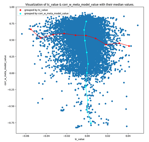
This is the plot similar to yours (but flipped), it is TC on x axis, and CVMM on y axis. The red line are median values grouped by TC and the cyen line are median values grouped by CVMM.

Now, this is the same plot, but calculated mean values for every model_name with sufficient history. Suddenly there is a visible trend. But, that is not accurate, because model_name != model. Pple can swap models under the same name. That’s why I calculated another scatter…

Following plot are calculated means for entities that are likely to be the same model (TrueModel). For every model_name I calculate big CVMM changes, if the model_name suddenly drops or rise the CVMM metric, then it is very likely different model. So after splitting each model_name to TrueModels this is the result.

And to remove a little bit the era influence, there is the mean ranked TC:

IMO it is still not perfect because some eras are underpopulated, but I think it is good enough. As a bonus chart there is a visualization of splitted model, the upper line is the model and the lines under are the mean CVMM deviation of all models and the deviation boundaries:
Screenshot from 2023-08-28 15-05-47

1 Like

I am sorry but I cannot agree with you. TC computation is round based. It is purely based on a model performance at that specific round. It doesn’t have notion of model past performance or average performance. That means if you want to try to visualize the metrics that affect TC then you can only rely on the information available to TC computation.

Finally CORR V2 has been added to the roundDetails.modelData API: the field is called v2corr20. We can now compare the old corr20 with v2corr20, although they stopped providing corr20 values in recent rounds (you can see the timeline plot for corr20 is shorted than v2corr20 one).

1 Like